Description:
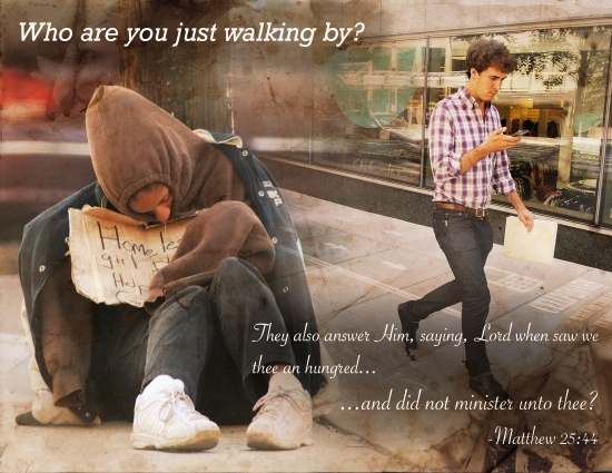
An inspirational montage made by the blending of three images, and the use of typography.
Process:
- I created a workspace of 8.5×11.
- I Brought in the two images of the homeless girl and the man on his phone
- I Added the texture image at the same size as the work space and gave it an over lay effect
- I added masks to both images an began to blend them together with the brush too at different sizes and opacities.
- I added the type sen above using two contrasting fonts to set the title apart from the scripture.
- Programs/Tools Used: Adobe Photoshop
Message: I wanted to highlight the idea that on a regular basis we find ourselves in the opportunity to serve others on behalf of The Lord. But often over look them.
Audience: Anyone that wishes to see how better they can serve God
Colorized/Filter applied and where: Overlay filter on the Texture image. Lighten filter on the photo of the man. Darken filter on the photo of the girl
Color scheme : Split Complementary and color names: Teal, Red, and Orange
Top thing learned: How to gradually blend three images
Font #1 Name & Category: Title: Rockwell Italic – Slab Serif
Font #2 Name & Category: Copy: Savoye LET Plain – Decorative
Thumbnails of Images used:
Sources (Links to images on original websites):


![sorry-can't-talk-now-I'm-on-a-no-cellphone-walking-lane-chongqing-theflyingtortoise.jpg]-005](https://adamjackson343.wordpress.com/wp-content/uploads/2015/05/sorry-cant-talk-now-im-on-a-no-cellphone-walking-lane-chongqing-theflyingtortoise-005.jpg?w=150&h=112)

Adam this is SO awesome!!! This image is super appealing to look at, and you did such an awesome job blending everything! It was neat to look at the bottom and see the original images, because they were so well put together that I wasn’t able to quite decipher what belonged to what. I love the filter you chose, and the message that you are sending. Serious props! I love it!
https://kyliebrownblog.wordpress.com/2015/05/30/project-5-spiritual-poster/
LikeLike
The message in your montage is incredibly powerful. I believe that part of its power comes from how seamlessly you combined the images. The text and texture overlay both work together to aid this design, and it is indeed effective. Very nicely done. If you want to check out a design that only uses two images without a texture overlay head on over to https://jacobrosshayes.wordpress.com/2015/05/31/132/ .
LikeLike
I think my favorite thing about your design is the message I love it! It really does touch the heart because I’m sure we can all relate to it. I also really like the way you were able to use the texture to your advantage as an overlay for your design. I think it’s amazing to look at the original pictures and see where you started and then to see where your individual perspective and creativity took you with those images, I really like the design overall! I also like how you incorporated the red and orange into your design! Really great job! 🙂
LikeLike
also here is a link-back to a fellow classmate’s blog post that I really liked:
https://hackerclaire.wordpress.com/2015/05/31/project-4-montage/
LikeLike
I really love your message. It wasn’t just didactic, but gave the message with more than just the text. It told it through the picture as well. You did a great job blending. I can’t tell where one image begins and the other ends. Excellent job! I’d love to get your feedback on mine:https://rcodycutler.wordpress.com/2015/05/29/project-4-montage/
LikeLike
Nice work man! I really love the message here. The two pictures worked very well with the texture you selected. The text you chose for the scripture was nice. I didn’t have to guess if it was scripture or not. The font screamed “this is scripture!!” I will leave you a link to my blog. It’s not on the blog roll for some reason, so I would love it if you would check out my work. Thanks Adamsky!
https://ethanscomblog.wordpress.com
LikeLike